
Expected to impact more website than recent Google algorithm updates than Panda and Penguin, ‘Mobilegeddon’ is expected to shake things up in search for all industries, worldwide.
Mobilegeddon Is Not a Date, It Is a Shift
Mobilegeddon is the name the digital industry has given to the algorithm update Google announced in February 2015 that will expand mobile-friendliness as a quality signal for websites in organic search. Google introduced ‘App indexing’ at the same time to leverage information collected from indexed apps as a factor for search engine ranking of apps for users who have the app installed and are signed-in to the app.
Mobile Websites Will Rule
If you have read my book, or my 2014 Search Engine Watch column “Mobile Now Exceeds PC: The Biggest Shift Since the Internet Began”, you know that mobile is not new to the search engine optimization discussion (SEO). Google has encouraged businesses and brands to embrace mobile for some time because internet users around the world are increasingly seeking content from search by way of mobile devices. Google’s decision to expand the influence of mobile in determining how to display websites in search engine results will make mobile-friendly websites winners, and non-mobile websites the losers.
When is Mobilegeddon?
Tuesday April 21, 2015 is the date Google identified as the ‘start’ of when the search engine algorithm will put more emphasis on mobile as a ranking or ‘quality website’ signal. Google’s goal is to make mobile-friendly content from websites and mobile apps easier to find in search. This date has effectively served as a line in the sand to motivate businesses and brands to become mobile friendly.
Truth is, mobile has a been a Google ranking factor for quality websites for some time. In fact, I shared Google’s position on mobile in my book on websites which was published in February 2013. So, mobile is not a new factor in the search engine algorithm, it is simply being emphasized more by Google in search engine results.
Mobile-friendly websites have been designated as such in Google search engine results viewed from a mobile device for some time.
Is Your Website Mobile-Search Friendly?
Want to know whether your website is mobile-friendly according to Google, or not?
Fortunately, you don’t have to be a tech wizard to get a straight answer on whether Google considers your website to be mobile friendly. The Google Mobile-Friendly Test is quick, easy and absolutely free. It will scan your website and let you know whether your website is configured properly to be considered a mobile-friendly website by Google.
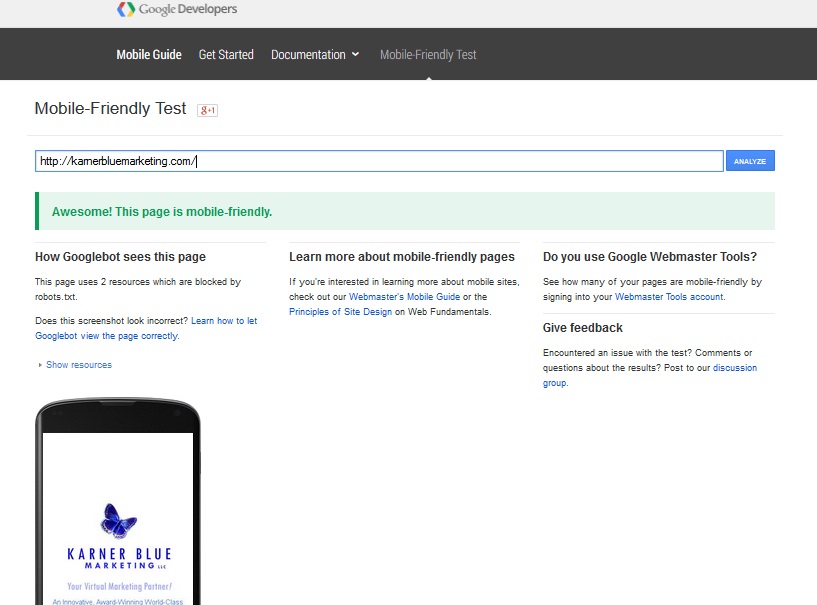
If your website meets Google configuration criteria, you will be congratulated, with a screen that looks like this;
If your website is NOT mobile-friendly, The Google Mobile Friendly Test will let you know. And, until you make the necessary updates to your website, you should be prepared for some level of penalization, or loss of traffic to any website that does not meet Google mobile criteria.
You will be presented with a screen like the one below of a website firm selling responsive (mobile-friendly) website design. This is just one of the many website design, SEO, advertising agency and marketing firms that sell mobile website solutions, but operate websites that not meet Google’s criteria.
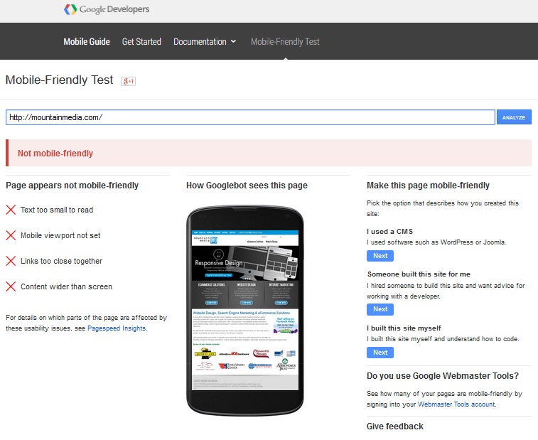
You can use the Google tool to check any website URL. As demonstrated by the results above, a website deemed not mobile-friendly may not accurately reflect the work of the firm or agency, so be prepared to do your homework to insure any investment you make toward mobile will meet Google criteria.
This particular result was a random selection and surprised me, as this firm does create responsive, or mobile-friend websites…Which leads me to my final and perhaps most important recommendation: Be prepared to make informed decisions when it comes to website design, content, SEO and related marketing initiatives. Things are not always how they appear – and that goes for positive and negative perceptions.
What to Do if Your Website Is Not Mobile Friendly for Mobilegeddon
April 21st 2015 marks the beginning of the Mobilegeddon algorithm update. If your website is not mobile-friendly on that date, you have not completely missed your opportunity to meet Google’s requirements. Google is likely to recognize when your website does become friendly to mobile device users. However, in today’s highly competitive search environment, the sooner you comply the better.
How to Make Your Website Mobile Friendly
Do not rush into building a mobile app or separate mobile website until you have determined how, exactly, your website will best serve all customer types on mobile devices.
Of course, I highly recommend any business executive, marketing director, IT, entrepreneur or small business owner seeking to get better results from their website to read my book, Million Dollar Websites: Build a Better Website Using Best Practices of the Web Elite in E-Business, Design, SEO, Usability, Social, Mobile and Conversion, which emphasizes a holistic approach toward the website as a business asset using proven best practices, including Google recommendations on mobile-friendly websites, BEFORE making a decision about whether to build a responsive website, separate mobile website or mobile app, or investing in website design, re-design, SEO or content.
Mobile-friendly websites are not just good for Google – they are good for all businesses and brands because their customers expect a mobile experience.
Have you seen a shift in traffic or search engine position over recent days or weeks?